Revenuebase
5 things hiding in the RevenueBase logo that were inspired by B2B sales and marketing professionals
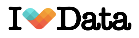
RevenueBase's logo incorporates five design elements inspired by B2B sales and marketing: a sideways heart representing love for data, forward-pointing direction for business progress, and blue-to-red colors symbolizing leads warming from cold to hot. The grid pattern represents clean data while wings suggest soaring performance.
We believe that data is at the heart of great sales and marketing. Our logo was inspired by B2B sales and marketing professionals who balance the emotional and data sides of their craft to form strong connections with their customers.
1. It's a heart (turned sideways) because working with us will make you love data (and love your data partner!)
2. The heart points forward because you use data to move your business forward
3. The colors go from blue to red because your lead quality goes from cold to hot
4. The heart is made from a grid representing your appreciation of clean and accurate data
5. The heart has wings because your sales and marketing soar!


Take it further
See the data behind the argument.
Every claim we make is backed by data you can verify yourself.